More about Data Visualization
Creating visual data dates back to the time when explorers used to create maps. The latter half of the 20th century saw a great boom in data visualization. With the introduction and large-scale advancement of computers, researchers and statisticians have a platform to store large amounts of data and process and analyze it easily and quickly./p>
The last three decades have seen the field of data visualization grow at a progressive rate. Now we have plenty of tools and techniques to present insights and data sets and are constantly making strides toward better data visualization.
So, what is data visualization precisely, and how does it help you engage your audience? The technique involves using charts, graphs, and other images to present data and other information. Such pictorial representation of data makes it visually appealing and makes for more effective understanding./p>
Individuals have a greater tendency to engage with and interact with images than texts in the digital age of social media. You will most likely attract greater interest and engagement with a post that includes pictures and videos. Ultimately, visual content contributes to improved marketing reach, higher ROI, and greater brand awareness.
There are two types of data visualization. Descriptive data visuals have the primary purpose of leading the viewer on a particular path. The majority of business dashboards that you encounter daily fall in this category.
On the contrary, exploratory data visualization involves data representation with several different perspectives. This technique encourages the audience to analyze the visual, engage in discussion, and then seek relevant solutions./p>
How is data visualization important from a social media marketer’s perspective? With the growth of social media, businesses feel a need for Data visualization tools that can give them detailed yet simple insights about their campaigns on various channels./p>
As individuals can parse trends and patterns quickly from visually represented data, data visualization can assist you in navigating complex data sets and making well-informed business choices for social media campaigns./strong>
Social media data visualization covers a lot more than simply likes and shares. You can gain a deeper comprehension of your consumers and how they interact with your business. Social media analytics can help you identify the channels that create the most leads and the kind of content that attract audiences./strong>
Here are some ways you can use social media data visualization effectively:/p>
Understand the Audience
Before creating any report or presentation, you need to understand your audience, i.e., your clients, co-workers, executives, teams, etc. The data should be collected and presented in a manner that your audience can grasp the ideas easily.
Use Graphs Wisely
There are plenty of graph formats available to present data. It can be overwhelming to choose a graph that can most effectively present the collected data. The graph type should be relevant to the data and understandable to your audience.
Keep it Simple
You should try to keep your data clean and simple to understand. Do not try to add a lot of colors or too many values on one page. Create simple charts with relevant numbers. You should also try to avoid using too many logos or clipart as these elements will only make your data presentation confusing.
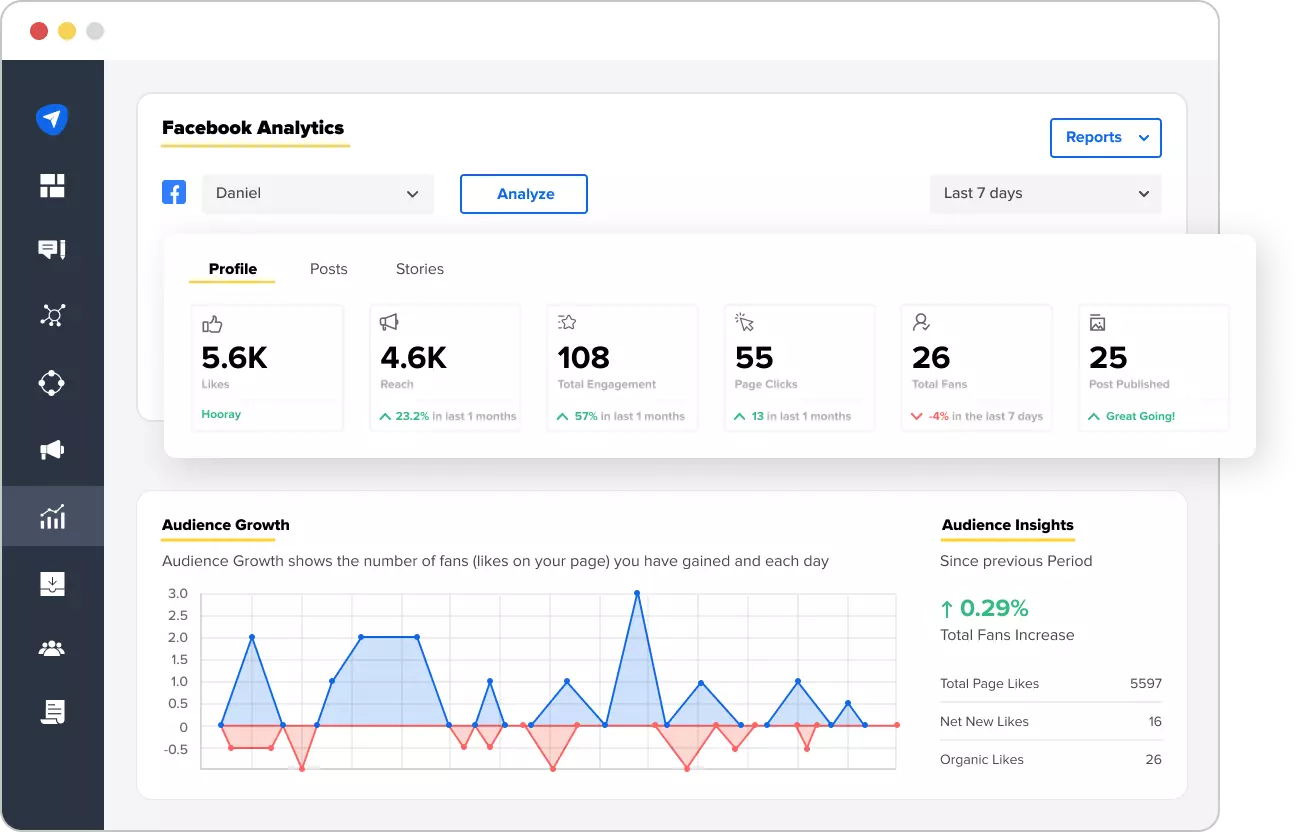
Here is an example of data visualization. This is a dashboard of the SocialPilot data visualization tool that would help you understand the analytics of your social media page.


